Hello all,
as we are working on the PR to bring the Jiminy board to mainline repo I had some problems to find where what is, or should be.
So I had the idea that a graph would help me visualize where which module is implemented.
Something like this.
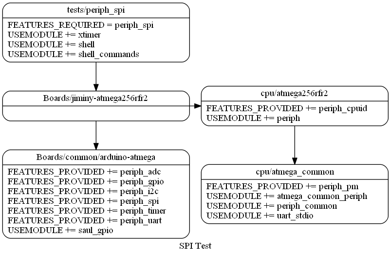
My idea was to maybe add a feature which uses doxygen to compile dot graphs for a test/application and board.
So when executing “make doc board=Bordname” in the folder test_spi then graphs for this project and board are created.
Maybe include graphs or such a Module, feature defines graph.
This would make it possible to just generate one graph for a test and add this to the depending readme or wiki page.
When implementing you could fastly grasp which feature are necessary and where they should be.
Also a comparison of the different cpu and boards could be done.
But for me the most important improvement would be I could build this for a board and fastly grasp where which feature is implemented.
This would also help newcomers to get a fast overview of what is where.
Is there interest for such a feature? Does any one have an idea of how to best implement this?
Best regards
Josua